The Hallmark of Good Design
Published 4 August 2021
By Henry Southan
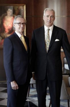
Simon Rawlings, creative director at David Collins Studio, talks to CODE about the pressures and processes of re-imagining Harrod’s iconic food halls and the elements that go into designing truly immersive spaces.
“I would like to think that you would walk into one of our interiors and get transported, you get taken to a place where you feel at ease, you’re comfortable, you feel special, and your senses are stimulated.”
David Collins Studio is an award-winning and industry-leading design studio that has worked on the interiors of some of the most iconic hospitality and retail spaces around the world. Their most notable work includes The Wolseley, Brasserie Zédel, Bob Bob Ricard, and their recent reimagining of the historic Harrods food halls.
Describing what makes David Collins Studio unique, creative director Simon Rawlings says: “We aren’t just designers. Many designers can put beautiful furniture and finishes together; we, however, focus on crafting emotions.” Rawlings identifies that the most successful projects come from the best relationships: Gaining a real understanding of the chef, the butcher in the food hall, the fishmonger or how the buyer wants the vegetables presented is a research element that the studio prioritises when crafting these spaces. “It’s spending the time upfront to really get to know the client, understand the architecture of the building, the lighting, sound, acoustics, and the feeling underfoot.”
Rawlings is up-front in acknowledging that the most important elements in any restaurant is the food and service, not the design: “We all go to restaurants that have zero design that we love. We go because we love the food, the service and the vibe.” He encourages his team not to stress over the perfect colour or the exact bespoke chair, as ultimately most people won’t remember the specific details of the chair they sat on or the exact colour of the wood or leather.
The architecture of a building is also a crucial element for the studio to consider. Rawlings says, “designers should respect the building they’re in. What really makes an interior stand the test of time is when it communicates with the architecture.” Without naming names he can think of many restaurant interiors that have been shoehorned into buildings that do not suit them, making the spaces feel themed rather than designed. Brasserie Zédel was a project where they were careful to avoid this. The building is an historic piece of London architecture where the only elements that make the restaurant feel like a French brasserie are the posters on the walls and the menus; the room itself is a classic art-deco ballroom. Rawlings notes that a French brasserie wouldn’t work in, say, a brand new glass office building.
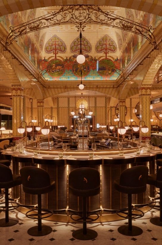
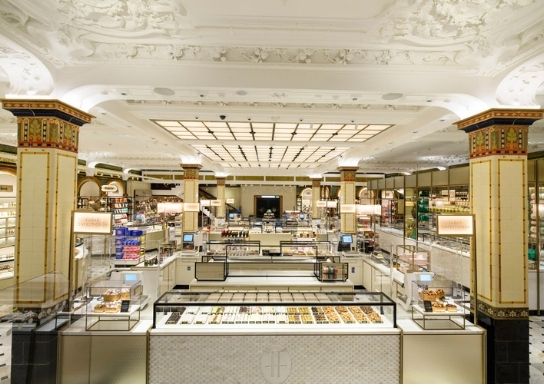
The reimagining of the Harrods food halls is the most recent project David Collins Studio has completed. “I have always wanted to design food halls,” says Rawling. “Food for me has always been a way of immersing yourself in an environment.” Food halls bring together a love for food, design, and restaurants and he goes as far as to say this might be his favourite project to date.
The processes and planning that the studio carries out in developing a space like the Harrods food halls is quite staggering. Rawlings says, “It was important that we understood the vocabulary of the four rooms all at the same time. Each room has its own architectural identity and importance from a historic perspective.” David Collins Studio considered every aspect of how the food halls worked, from how they get restocked to the food produced and how people navigate the space every day.
A major change one might notice when visiting the redesigned halls is that the food production has been brought out from behind the scenes. Though Harrods have always made most of their food in store, it was always produced out of sight. Rawlings notes by bringing the production back onto the shop floor, people can better feel a connection with the food: “I fell in love with the idea that you can sit in the middle of one of the halls and have a coffee that was roasted two metres away and croissants that were baked a metre and a half in the other direction and consume them all in the same space.”
Rawlings says he still feels an enormous amount of pressure when working on such an iconic space. “I can’t just stand in front of the client and tell them I’m going to polish the tiles and put some cabinets in. I’ve got to get them to see the vision and take them on that journey.”
Rawlings is keen to emphasises that David Collins Studio doesn’t solely work for high-end hospitality names like Harrods, Corbin and King and the Nobu group. The studio also has a track record of successful projects for high street brands such as Eat and Pret a Manger. He recalls the studio team doing shifts at Pret to really understand the space from the perspectives of both the customers and the staff. “It’s so much more than just design, everything we do is not only creative, but very technical too.”
CODE asks Rawlings what his favourite restaurant in London is. After some deliberation, he settles on Brawn on Columbia Road, a modern classic.


